redesigning credit karma money
Rethinking the discovery strategy and architecture of the primary surfaces of a banking app
The backstory
Mapping the content strategy
When Credit Karma decided to design a banking product, they started with the Save product, an MVP (minimum VIABLE product) to see if they could master the basics of money movement and neo-banking. Credit Karma users were asking for a savings tool, so its success wasn’t a huge surprise. But there was more revenue available with a checking product, so the team built and shipped the checking product, Spend.
Now there were 2 utility surfaces, Spend and Save, users needed to navigate to from the front door of Money. We also needed to increase the contextual discoverability of our features, which ranged from banking (mobile deposit, direct deposit, etc.) to credit (eg. Credit Builder). The problem: these were all built by different teams at different times and there was no unifying user experience. The Money front door was cluttered with distractions, users couldn’t find their money, and the ones that didn’t churn, were calling support to navigate the app. So the first thing we did was listen to the users.
Research, synthesis and ideation
First we watched users navigate the product to learn their expectations and frustrations. User testing videos (unmoderated user testing and synthesis took 3 days), along with Fullstory videos of specific interactions by real users, helped us identify some core comprehension problems and churning points. We synthesized the results of the testing and shared it in an ideation workshop with cross-functional contributors.
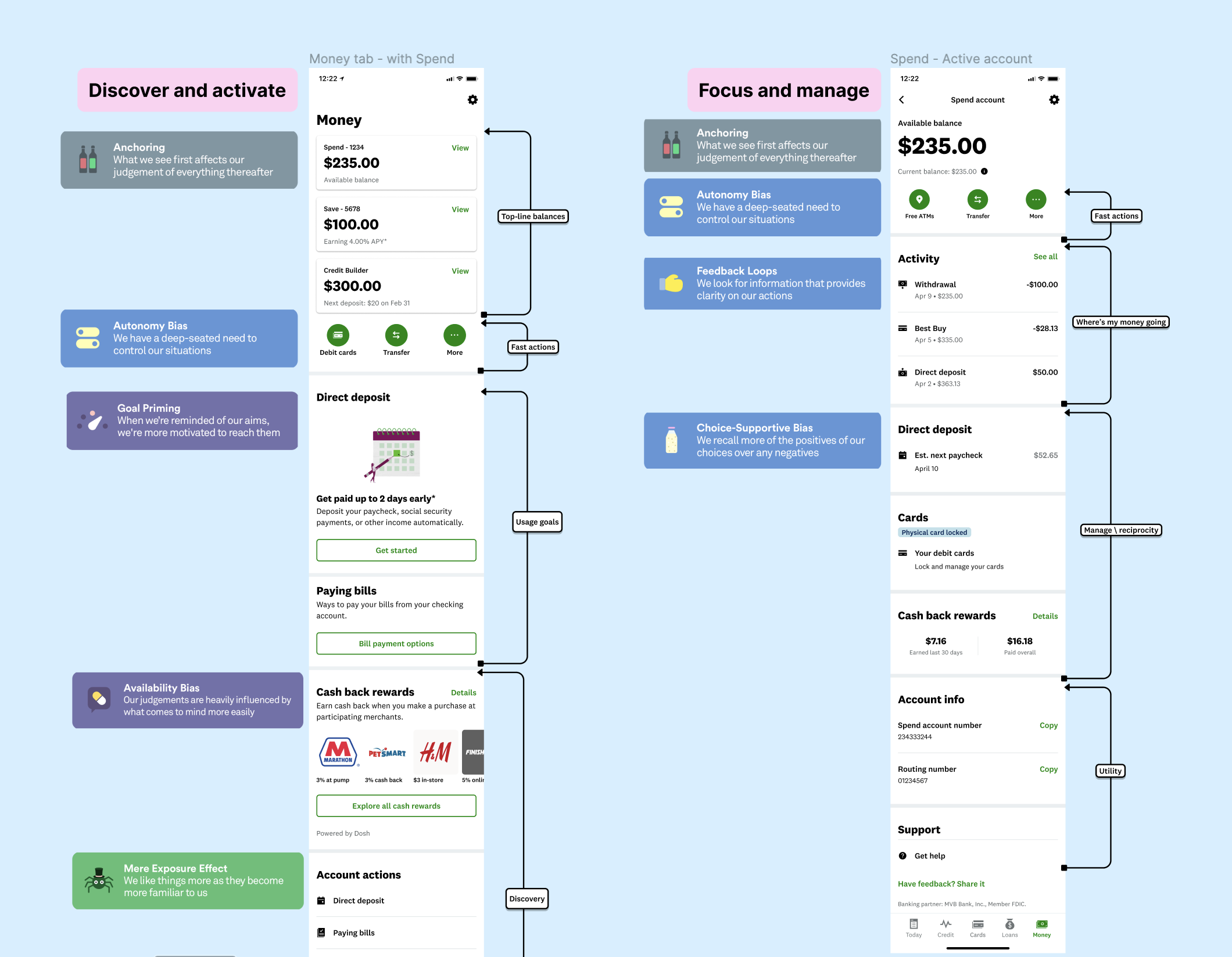
Together we defined some core principles for each surface, then evaluated the cognitive behaviors driving engagement of different features to determine which features made sense to promote for discovery on which surfaces. With input from the whole team, the product design team cycled through divergent approaches to the problems and solutions discussed in the workshop to define a content strategy for the 3 surfaces.
Money Tab (front door) was for orientation, discovery, and activation, but will prioritize user needs over business needs, because until the user has taken care of the needs that brought them to the app, we’re less likely to be able to engage them in discovering new features.
Spend and Save hubs were utility surfaces that should be dedicated to focusing and managing those aspects of their banking without distractions.
Content strategy and experience design
We converged on a content strategy we hypothesized would orient users to navigate and discover on the front door surface and to go to the deeper surfaces to do their work without distraction. On the deeper surfaces, we want the product to get out of their way, to assist them with what they came to do with their money. We needed to serve basic banking needs first so that improved navigation, discovery and engagement would be meaningful.
Money Architecture
Anchor users on their money, where it is and how to get straight to it.
Provide a “Quick Action UI” that makes the primary actions users take in the app easy to discover and engage.
Provide “Activated Rows” with direct access to deeper features the user has previously engaged, where they can track top-level data and easily access the feature.
“Footer Actions” are stable rows consistently surfacing available features they can engage.
Information Architecture of Spend and Save Surfaces
Anchor them on their money.
Provide fast access to their primary actions.
Activity data that provides feedback loops for recent activity and access to all activity.
Activated rows that are directly relative to the account surface they’re working on.
Utility details relevant to the account surface they’re working on.
From minimum VIABLE to minimum VALUABLE product
After qualitative user testing of our prototypes, we made some slight adjustments and ramped the new experience to a small percentage of users. The results were dramatic. Before we shipped the designs to a larger ramp, we shared results and proposed designs broadly with the team and stakeholders to identify ways to improve it from a minimum viable product, into a “valuable” product. We adjusted a few aspects of the content strategy to provide durable feedback loops for account-specific features (eg. when managing your checking account as a direct depositor, you may want to see when your next paycheck will arrive).
Outcomes
Faster and increased feature discovery
Increased usage of basic banking features.
Discovery of features increased by 19-54%.
Decreased support calls about navigating the app.
Increased money movement led to increased adoption and card activations.
Feature adoption increased up to 45%.
Discovery of the new debit card surface increased almost 10%.
Feature adoption


